ButtonGroup
Description
The ButtonGroup flat page component is used to create (render) one or multiple buttons on a flat page.
Properties
| Property | Description |
|---|---|
showIfExpression |
When the showIfExpression property is defined, it adjusts the component visibility based on the boolean value returned by the expression. |
ButtonGroupItem[] |
List of buttons to be rendered. |
ButtonGroupItem properties
| Property | Description | |
|---|---|---|
text |
Button Text. Localized key. | |
theme |
“success”, “primary”, or “default” | |
behavior |
ButtonBehaviorComponentModel | |
custom |
Add a custom expression or function to be triggered when the button is tapped. | |
phone |
Enter a phone number so that a call is initiated to the number when the button is tapped. | |
sms |
Enter a mobile number so that an sms can be written and sent to the number when the button is tapped. | |
email |
Enter an email address so that an email client is opened and an email can be written and sent when the button is tapped. | |
openUrl |
Enter a website address that will be opened in a browser when the button is tapped. | |
openSelector |
Add a customized selector page that opens for users to select data from a list. Additional custom functions can be used as demonstrated in the example below. | |
disabled |
A data expression that returns a boolean that indicates whether the button is disabled or not. In the UI, the button appears greyed out and is not active. | |
icon |
The icon name string. See the list of supported icons below. |
Button group layout
The layout of button groups depends on the number of buttons in the group. The images below illustrate how the buttons appear in different group sizes:
One button

Two buttons

More than 2

Button behaviors
A button behavior can be specified for each button to impart properties related to its function. The behaviors that are supported are: Custom, Phone, SMS, Email, OpenURL, and OpenSelector. A description and example of each of these is provided in this section.
Custom behavior
When the button is tapped, an expression (or function) is triggered.
Example:
 "behavior": {
    "type": "custom",
    "functionExpression": "cf.setButtonGroupProxyData('From one button')"
  }
Phone behavior
When the button is tapped, a phone call is initiated to the phone number on the button.
Example:
"behavior": {
    "type": "phone",
    "phoneNumberExpression": "pageData.PhoneNumber" /* Phone number expression */
  }
SMS behavior
When the button is tapped, an sms message to the phone number on the button is initiated.
Example:
"behavior": {
    "type": "sms",
    "phoneNumberExpression": "pageData.SmsPhoneNumber" /* Phone number expression */
  }
Email behavior
When the button is tapped, an email to the address on the button is initiated.
Example:
"behavior": {
    "type": "email",
    "emailExpression": "pageData.EmailUser" /* Email expression */
  }
Open URL behavior
When the button is tapped, a web page is opened with the URL on the button loaded.
Example:
"behavior": {
    "type": "openUrl",
    "urlExpression": "pageData.URL" /* Url expression */
  }
Open selector behavior
When the button is tapped, a selector page is opened and events can be used for further processing.
Example:
export interface OpenSelectorButtonBehaviorComponentModel extends ButtonBehaviorComponentModel {
    selectPage: SelectPageConfig;
    events: {
        onDataChosen: FunctionExpressionType;
    };
}
export type SelectPageConfig = {
    searchBar: {
        filterOnProperties: string[] | undefined; /* Filter on which properties of item */
        placeholder: LocalizedKey; /* Search bar placeholder */
    };
    itemCaption: LocalizedKey; /* Row caption */
    itemTitle: LocalizedKey; /* Row item title */
    dataSourceExpression: DataExpressionType;
    emptyText: LocalizedKey; /* Empty text when selector page has no data */
    filterExpression?: DataExpressionType; /* Filter item source before displaying to user */
    singleSelectionConfig: {
        dismissPageAfterChosen: boolean;
    } | undefined;
    isMultiSelect?: boolean; /* Single or multi select */
    header: {
        title: LocalizedKey; /* Page title */
        hasClearBtn: boolean; /* Has clear button or not */
    } | undefined;
    onlineSource?: SelectPageOnlineSource; /* online source definition, see https://skedulo.atlassian.net/wiki/spaces/ProductDevelopment/pages/2623799357/Online+Fetch+-+Way+to+fetch+readonly+data+from+online+mode#Online-source-from-Single-Selector-%7C-Multi-Selector  */
};
Example: Adding a custom function to the OpenSelector behavior
Adding the behavior:
"behavior": {
  "type": "openSelector"
  "selectPage": {
    "itemTitle": "form.ShowCasePage.SelectDogItemTitle", /* Row item title */
    "emptyText": "form.ShowCasePage.SelectDogEmpty", /* Empty text when selector page has no data */
    "title": "form.ShowCasePage.SelectDogTitle", /* Selector page title */
    "searchBar": {
      "filterOnProperties": ["Name"]
    },
    "dataSourceExpression": "sharedData.__vocabulary.DogTypes" /* Local filter option */
  },
  "events": {
    "onDataChosen": "cf.handleDogChosen(items, pageData)" /* Trigger expression after user chooses data */
  }
}
Adding the custom function:
function handleDogChosen(items: any, pageData: any, {extHelpers}: Extras) {
  if (items.length == 0)
    return
  let item = items[0]
  extHelpers.data.changeData(() => {
    pageData.DogName = item.Label
  })
}
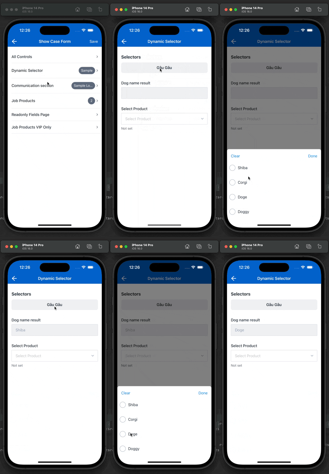
The dynamic selector in the example above would appear as follows in the mobile extension:

List of supported icons
| Icon name (a - l) | Icon | Icon name (m - z) | Icon |
|---|---|---|---|
| alert | map | ||
| attachment | mapPin | ||
| calendar | mobile | ||
| camera | more | ||
| check | newMessage | ||
| checkCircle | offline | ||
| clock | person | ||
| copy | phone | ||
| date | photo | ||
| debug | search | ||
| delete | searchFilter | ||
| edit | select | ||
| settings | |||
| fieldClear | shareAndroid | ||
| fieldSearch | shareIOS | ||
| file | shifts | ||
| filter | signature | ||
| info | sms | ||
| job | target | ||
| launch | travelDistance | ||
| location | |||
| logout |
Feedback
Was this page helpful?